 Online Store
International efforts, such as the Paris Agreement, aim to reduce greenhouse gas emissions. But experts say countries aren’t doing enough to limit dangerous global warming.

Geoeconomics, in pictures
More on:
This post is by Brad Setser and Paul Swartz of the Council on Foreign Relations.
No doubt today’s GDP release will attract the lion’s share of the econoblogosphere’s attention. But sometimes it is a good idea to counter-program.
Paul Swartz, I and others at the Council’s Center for Geoeconomic Studies have been – at the prodding of our boss – trying to come up with indicators that capture “Geoeconomic” risk. Or at least to develop measures some key “geoeconomic” concepts, with geoeconomics defined as anything that touches on both the economy and geopolitics. An example might be the gapminder chart we did for the Council’s multimedia spectacular on the financial crisis that touches on the question of whether the G-7 still brings together the world’s most economically powerful countries.
I am not sure that we have succeeded, though I do think we have come up with some interesting ideas – ideas, though, that need to be stress tested with a bit of external scrutiny. Call this a very rough working draft.
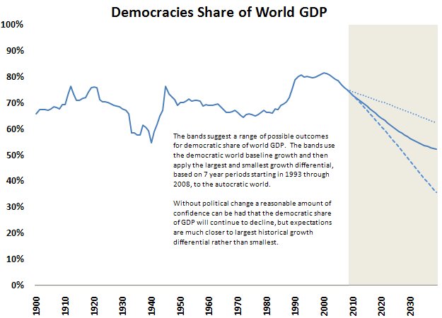
One idea has been to look at what share of the world’s total economic output is produced by democratic countries. To do this, we weighted output by a measure of a country’s political openness (from the Polity IV project). A low score implies that all of the world’s output is produced in countries that are not democracies. A high score means all the output is produced by countries that are well-functioning democracies. And a score in the middle means something in the middle – either there are a lot of economically large democracies and a lot of economically large autocracies, or that a lot of global output is produced by countries that aren’t total autocracies nor perfect democracies.
The results are interesting; the end of the Cold war increased the share of output produced by the world’s democracies. But China’s ability to grow rapidly with significantly democraticizing has made the global economy a bit less “democratic” (in the sense that less of the world’s output is produced by democracies).
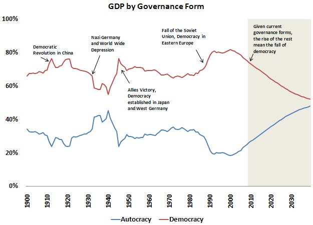
That implies that if current economic trends – meaning the gap between the rate of growth between autocratic and more democratic countries -- continue, the share of global output produced by democracies will decline over time.
Why does the "politics" matter -- two potential reasons:
First, democracies are likely to prefer a world populated by other powerful democracies to one that is not. And second, democracies allow for peaceful political transitions; they are less brittle than autocracies -- and thus arguably more stable, economically and politically.
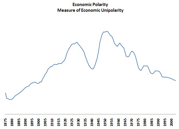
Geostrategists are also interested in how concentrated economic power. Paul came up with a measure of that, one that looks at the distribution of global economic output (actually the distribution of output over a basic threshold for poverty, so if one country is rich and the rest are poor, we assume that power is concentrated not dispersed). The United States’ economic rise in the twentieth century (prompted in part by wars in Europe) had the effect of concentrating economic power. The rise of the BRICs by contrast has had the effect of dispersing power (some might call a greater dispersion of economic power a kind of democracy ... ).
Our other ideas are variants, in some sense, of the first idea.
We compared the share of global oil output produced by democracies to the share of global economic output from democracies. While most global output is produced in democracies, most oil isn’t – and most oil exports come from non-democratic states.
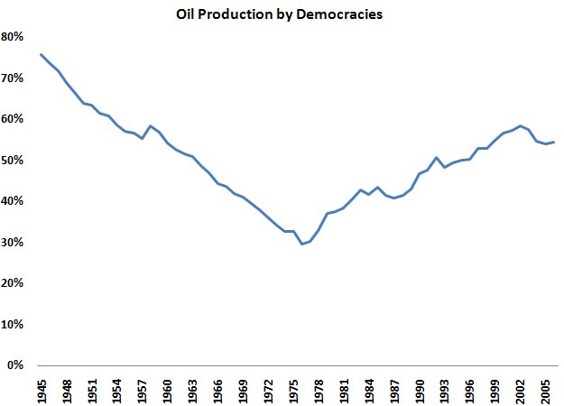
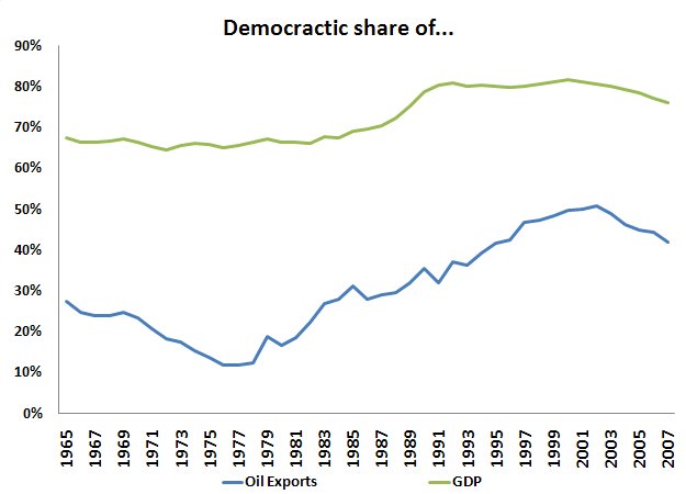
It is interesting though that the share of oil exporters coming from democracies rose after 73; increasing the price of oil made production in the North Sea attractive – and Mexico’s oil exports rose along with its democracy score. That trend though also changed a bit recently.
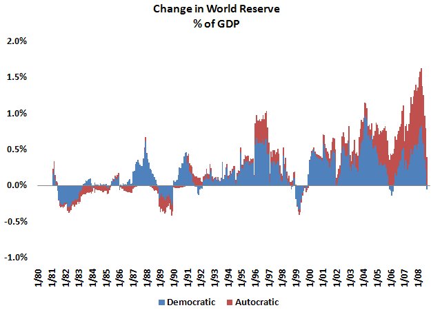
And finally, we looked at global reserves and the global flow of funds. Reserves are rising relative to world GDP – and most reserves are still held by democracies (if we counted the assets of sovereign funds, the graph wouldn’t be as favorable to democracies).
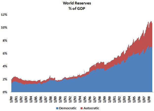
But recently reserve growth has been weighted toward countries with low scores on a democracy index.
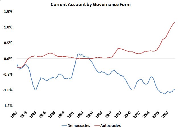
And it turns out that if you weight the global current account surplus by a countries political regime, the surplus countries are significantly less democratic than the deficit countries. In broad terms, non-democracies now finance democracies. The result here is sensitive to whether or not the eurozone is treated as a single unit or a set of different countries.
Three questions:
Do our indicators make sense?
Are they at all useful and interesting?
Are there better avenues/ approaches to try? Different types of risks that are worth tracking?
More on: